
Fun with Patterns and Colors
Hello again!
Today I wanted to touch on patterns and colors, and how to balance very different visual and tactile textures.
When mixing patterns, it is quite easy to end up looking like an optical illusion, so one must take care in choosing articles that are not too combative in nature.
In the example seen below, a "base" is achieved with a rather common patterned shirt: the grand stripe. There are hints of blue in the suit fabric, which the shirt supports.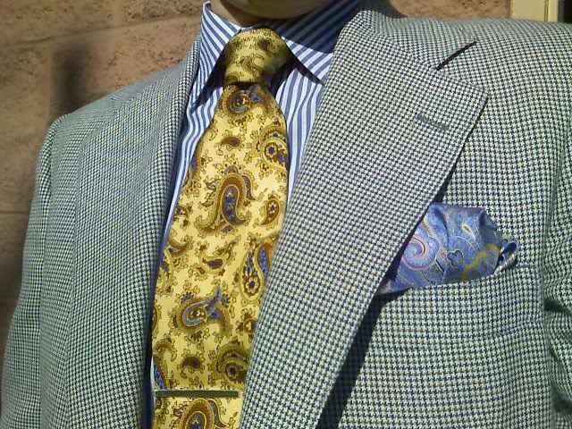
The bolder paisley pattern in the tie echos the gold found in the suit fabric, as well as the blue from the shirt, and introduces a neutral color; in this case, brown. The brown should be repeated in the shoes and belt, which for todays example, we need not show.
Again we see the paisley print in the pocket square, along with the blue and gold colors, but in much more vibrant hues, along with a hint of pink to add an unexpected brightness to the ensemble.
The suits boasts a mini houndstooth pattern with colors that are supportive of the other attire. This example is well-executed, and is intended to serve as inspiration for those who possess the daring to dress both conservatively and playfully all at once!
Have fun, and let us know what you think!
Cheers,
Paul
Labels:
color,
color coordination,
pattern
![]()

0 comments:
Post a Comment