Pages

Showing posts with label accessories. Show all posts
0 comments

The Velvet Jacket

This will be quick. For the Fall and Winter seasons, it is imperative to have a velvet jacket at your disposal. The velvet jacket can dress up blue jeans for a casual ensemble, and can serve as the focal point for alternative black tie.

The key is this; with jeans, wear a crisp white dress shirt sans tie. The shirt should be nicely fitted. For alternative black tie, wear a black bow tie, black trousers, and either black cap-toe shoes, velvet loafers, or opera pumps (scratch that... save the pumps for white tie... unless you're in for serious rule breaking).

One should still wear a nicely fitted white dress shirt or a tuxedo shirt, although the look works better without a tuxedo point collar, but rather a spread or traditional point collar. French cuffs look best, and a subtle tactile texture in the shirt comes across very nicely.

For in-betweens (pictured) keep it minimal. White shirt, black neck tie (or solid color complimentary to your jacket color), black trousers, nice black shoes. Go bold if you must, with a brightly colored velvet jacket, such as this red Tom Ford offering with shawl collar (photo 2), but feel free to throw in some pattern to add some nonchalance and to deformalize the look a bit. For more formal occasions, one can never go wrong with midnight blue (left). In all cases, be respectful of the inherent formality of the velvet jacket and allow one 1/2 inch of cuff to show.

Velvet jackets are available from very low to very high prices, from a multitude of designers. I am wearing a customized vintage Hickey Freeman in photo 1. Tom Ford offers something similar today, but for lower prices, check Calvin Klein at Macy's, or just browse. Velvet jackets are big this season and everyone offers them. Get down with it!

Cheers,
 Paul

0 comments

Bond's Accessories: Persol

It has been a while since I last wrote about sunglasses, but I have in the past mentioned my love of Italian sunglasses manufacturer Persol, and in an unrelated post, discussed the refined, insouciant character offered by a lighter colored pair of sunglasses than basic black. Today, I combine the two. Persol sunglasses, and tortoise-shell frames.

Persol calls their tortoise-shell colored frames "Havana". Call them what you like, the lighter colored frames catch more attention and can better compliment a colorful ensemble than black frames. Black is unimaginative in most cases- granted a black suit and shoes would probably cry out for black sunglasses, but in other scenarios, a lighter frame accents the different color hues in most clothing.

I personally have been blessed/cursed with a fair complexion, light hair and skin tone (yeah, that's me on the right), and tortoise-shell frames break the stark contrast that is achieved when I wear all black frames. Conversely, individuals with either olive, brown, or reddish skin tones will have their complexion complimented by the different shades of brown and amber present in a tortoise-shell frame. Everybody wins, you see.

My newest aquisition are these Persol 2720-S sunglasses, which were worn by Daniel Craig's James Bond in the 2006 film, Casino Royale (see picture, below). I opted for the brown lenses while Bond wore frames with green lenses, but I like the way that the Persol brown-orange lenses block out all the sunlight without making indoor lighting seem nonexistant (for the times when walking indoors briefly after forgetting your phone at home or dropping something off at the post office or making a bank deposit... not when gong out clubbing and trying to look cool by wearing shades indoors... you actually look like a douchebag when you do this. Trust me).

I have quickly fallen in love with this pair of shades. My wife tried to "adopt them" and I told her she'd better start trying to come up with a way to bump me off if she wants to inherit them. Like Charleton Heston said, "...From my cold dead hands." They're mine. I offered her my Ray Bans. She refused.

For those who are unaware of the history, Persol comes from the Italian words per il sole, meaning, "for the sun". The brand was founded in 1917 by Giuseppe Ratti. Its trademark is the silver arrow, and several of the company's glasses feature this symbol.

Persol was a heavy influence in the production of sunglasses. The company developed the first flexible stem.
Persol was introduced to the United States in 1962. Its first boutique opened on Rodeo Drive in Los Angeles in 1991.

Steve McQueen popularized two Persol models: the 714 folding sunglasses and similarly styled 649. He wore a special pair of 714's with blue lenses (now avaiable as a Steve McQueen Special Edition model at http://www.persol.com/) in The Thomas Crown Affair and was often photographed wearing the 649 model.
One of the most iconic images of Persol sunglasses can be seen in the movie Divorce Italian Style where Marcello Mastroianni wears a pair of black 649s; Mastroianni also has a pair of Persol sunglasses on in almost every scene in the movie La Dolce Vita.

Persols can be seen on celebrities as frequently as plastic surgery. Jack Nicholson, Jake Gyllenhall, Jay-Z, George Clooney, Sharon Stone, Pierce Brosnan, Bill Murray, and a slew of others are seen wearing them regularly, but that's not to say that celebrity iconography is what makes them worth a damn.

Persols are durable, stylish, and fit like a glove, thanks to the brand's patented "Meflecto" cylinders in the arms, which hug and flex comfortably around the wearers temple to provide a custom fit. The lenses are made of high-impact glass rather than plastic, and resist scratching better than any other sunglass lens on the market. The lenses also provide unsurpassed clarity. Each pair is hand-made in Italy and no two pair are absolutely alike, like a utilitaritan piece of art that one can wear on his face.

Upon reflection, I don't know exactly what the purpose of this post was, whether it was to plug Persol, make a James Bond reference, promote tortoise-shell frames, or just to say, "Hey, check out my new toy." Maybe it was a bit of all of these reasons, but I can guarantee you this: each reason was in the service of style. After all... that's why we're here. Isn't it? 

Cheers.
-Paul

0 comments

Layered Look for Fall

I am so incredibly excited that Fall is here. It is, in my opinion, the most opportune of times for men's fashion, and gives us all a chance to amp up our style game. The crisp lines of summer fabrics can be traded out for layers of soft, tactile fabrics like wool, cashmere, and velvet (yes, velvet... but that's for another post!). In the early days of Fall, a day that begins in the 50's or 60's can easily work its way up to the mid to upper 70's, and then drop to the 40's by nightfall. This is why layering should be your secret weapon.


The look depicted today is just an example of layering tactics. Experiment on your own, and as it gets colder, the items will certainly change. What you see here today will almost definitely be accompanied by a trenchcoat when cold rainy days come, and the blat of khaki color will compliment the current ensemble. But don't let me get carried away with myself. Let me explain today's look.

The Shirt: The Oxford Cloth button down is the perfect Fall shirt. A little bit heavier than cotton broadcloth, the OCBD has a little heft to it, which serves well to stifle the cutting effect of a cold breeze.

The Jacket: Some say that everyman's wardrobe needs a navy blazer. I have two; one of a light-weight tropical wool for warmer months, and one (pictured) of a heavier cashmere-wool blend for the cooler months. This jacket goes with everything from jeans to tailored trousers, and works great as a layering piece. In Fall and Winter I tend to go for the more pronounced pocket square, again breaking away from the crisp, pressed lines of summer. The square adds some punch.

The Layer (Cardigan): A cotton cardigan makes for an ideal layering piece, because it is relatively light-weight. In early Fall, between the wool blazer and the OCBD shirt, only a slight bit of extra insulation is needed around the midsection. As you can see in the picture, this one is short-sleeved, which is perfect as the day warms up. At this point, one has the option to ditch the jacket and roll up the sleeves, as shown, or ditch the cardigan and put the blazer back on. I just love having options!

The Tie: I chose a bowtie for this look not just because of the color combinations I am wearing, but because A) Bowties are BIG this season (finally!!!), and B) I enjoy the preppy aesthetic that the bowtie lends to the casual nature of the outfit I chose.


The Jeans: In Fall and winter, a darker jean is preferable. In Spring and Summer one can lighten up a bit to shake the winter blues, but colder months call for a darker, somber color, like these that sport a deep indigo wash. Again, I chose jeans to flirt with the less casual looking, preppy above-waist look.

The Shoes: The brown wingtips. Again, I have two pair of these. One is a deep chocolate brown that I keep immaculate, and the other are these, which are lighter in color, and I let them get a little beat up, just to shake some polish from a casual outfit. Wingtips are great for Fall. Period.

The Extras: This outfit illustrates perfectly the extra flair that a nice umbrella can lend you, as I mentioned in the last post. Here in Charlotte, NC, the weather forecasts have been changing daily. A day that calls for no rain suddenly becomes a sling-fest of cats and dogs. In the particularly fickle early days of Fall, a sweet-looking umbrella just always works.

If one does remove the jacket and roll up the sleeves, one should wear a watch with heft, which compliments a layered look. Chronographs are cool. I tried to keep the color scheme in line with the shoes, since I'm otherwise bathed in reds and blues. Chunky. Brown. Bold. Bitchin' and BadAss.

Enjoy the season for layering. Enjoy the season to kick your style game up a notch. Enjoy soft, luxurious clothing. Enjoy the Fall.
Until next time,
Cheers!
-Paul

1 comments

Umbrella Review: Brooks Brothers vs. Leighton

Good day, gentlemen. Fall is here, and it's time to prepare for some rainy days. It's also time to amp up your umbrella game. Fold up travel umbrellas are convenient and they keep you dry. They can fit in a briefcase or dangle from a lanyard around your wrist. Golf umbrellas keep you dry as well... along with everybody else in your zip code. Neither of these umbrella types are particularly stylish. Travel umbrellas are strictly utilitarian, and golf umbrellas are a roving billboard for Wachovia or Bank of America.

What a gentleman needs is an attractive stick umbrella, free of crazy bright colors, company brands, and small plastic handles. A wooden crook handle and (when collapsed) a slim silhouette, a generous (but not gigantic) canopy, and a dark, solid color. Do you notice the funeral scenes in movies? I don't care which movie, because they're all the same. The day is dreary and rainy, and everyone stands under a sea of black umbrellas as they mourn. NONE OF YOU fine gentlemen need to be the lone idiot with the enormous red, white and blue BofA umbrella. Trust me! Now I'm not saying a fine looking umbrella should be restricted to funerals- quite the contrary. But one should be able to carry it anywhere to fit in...

...or stand out! Remember The Avengers' John Steed, who carried his classic stick umbrella with him everywhere, even on sunny, bone-dry days? Remember Sean  Connery as Henry Jones in Indiana Jones and the Last Crusade (whose umbrella came in quite handy in warding off a flock of angry pidgeons, or something to that effect), who had his umbrella with him always? A nice umbrella is like a sidearm. It can go with you everywhere, even if you don't intent to use it, but you'll never know when you might need it!
 Today I review two classic-looking stick umbrellas, one from Brooks Brothers (top left) and one from a company called Leighton (top right). Let's get started!

First off, both umbrellas have a classic, refined style. Black canopy, slim design, and wooden crook handles. The Brooks Brothers "New Stick Umbrella" has a wooden shaft as well, while the Leighton "Executive" has a shaft fashioned of steel. Leighton makes one with a wooden shaft as well, which actually costs less money than their steel shaft version, so I wouldn't consider the shaft material on either umbrella to be a pro or a con, although the wood does look nice.


Both umbrellas have eight ribs that support the canopy. The Brooks Brothers (above left) version employs fiberglass ribs that are attached to the canopy with (bummer) plastic grommets. The Leighton umbrella (above right) has steel ribs attached to the canopy by a metal hinge. A much stronger design, if you ask me.


The tips of these umbrellas are both wood. The Brooks Brothers umbrella has an attractive metal ferrel at the base of the wooden tip, while the Leighton has a thicker, shorter tip with no added adornments that matches the wood of the handle. I'd say that the BB umbrella tip probably looks a bit nicer, but the very end is just painted black and not very smooth, so it looks as if something fell off or came unglued. I'd call this round a draw.


Both umbrellas boast a generous sized polyester canopy. Of the two, the Leighton is Teflon coated. The Brooks Brothers umbrella is not. Major score for Leighton. Also, the Leighton has an auto-open feature, while the Brooks Brothers umbrella is manual only. Another point for the Leighton.

The Leighton has a lifetime replacement warranty.
There is no stated warranty for the Brooks Brothers umbrella. 3 - zip Leighton.

The Brooks Brothers umbrella does have their   attractive script logo on the canopy strap, which is a nice little touch. They also have a black canopy version with the BB Golden Fleece logo dotting the surface, which looks nice, but the ferrel on the wooden tip is plastic rather than metal, which turned me off to that design.

The Leighton umbrella has a nice little touch on the handle as well; a leather wrapping with the Leighton name embossed on the surface. The Leighton also has a metal ring to secure the rib points directly above the handle. The BB umbrella has no such feature.
In terms of dollars and cents, the Brooks Brothers umbrella retails for $60, which is approaching a lot of money for what you're getting. The Leighton Executive retails for $30, and is available in several colors at http://www.umbrellasandbeyond.com/ for $24, I believe.

When all is said and done, my endorsement goes to the Leighton, mainly because of this reason: when opening the Brooks Brothers umbrella for only the third time, prior to even testing it in the rain, one of the plastic gromets that secures the ribs to the canopy snapped, leaving one rib flopping about and the umbrella unusable. I returned it for a refund, and purchased the Leighton, which so far seems damn-near indestructable.

Both umbrellas are made in China (which greatly disappointed me on the Brooks Brothers model, considering the price tag), and the Leighton is clearly a higher quality product, which cost me less than half as much. I am a big fan of Brooks Brothers, as some of the previous posts would indicate, but they never have specialized in umbrellas, and I'll consider them in the future for their own items, rather than something they're just sticking their name on.

Anyway, go out and get yourself a man's umbrella, and give your novelty golf umbrellas to the Goodwill. If you must have something that large, Leighton also sells a Doorman model, with 16 ribs and a 60" canopy which retails for a mere $36, but unless you routinely walk around with a wife and 3 kids under your umbrella, a standard stick size will do. Travel umbrellas are great for... well... traveling, or to have in your briefcase as a backup, but we're men of distinction here. Get something that makes a statement that you have class.
Until next time,
Cheers!
-Paul


0 comments

Buckling Down: Watch Entry III

In keeping with the recent theme regarding wristwatches, I wanted to present another bracelet/band option for a more elegant and less casual look than the ribbon band I discussed last time. Leather bands always lend an aura of elegance to a watch, especially when fashioned of an exotic skin like crocodile or lizard.

Today I'm not talking about material, however, but about the clasp type of the watch band.
Metal bands are typically a little bit sportier than leather bands, but are often favored  by wearers because of  durability issues and the security of the clasps that typically accompany a metal band. There is a way to capture the elegance of a leather band and the security of a metal one; a leather band with a deployment clasp (pictures 1 & 2 - click to enlarge).

The pictures provided pretty much do the talking here and take away a need for too much explanation, but simply stated, a deployment clasp on a leather band allows one to position a pin in a bracelet hole for a good fit, and after that, the clasp can be snapped open and closed without having to pull the strap through the buckle each time. The result is a watch that fits a bit more snug on the wrist (photo 3), and often feels more comfortable on the wrist.

Having one of these groovy bands doesn't have to break the bank, either. They can be picked up on ebay for next to nothing. They are a good option for those who like a lather watch band. Give it a try!
Until next time (where we'll probably have one more watch-related discussion),
Cheers!
Paul

0 comments

Groovy New-Old Vintage Watch, Part II

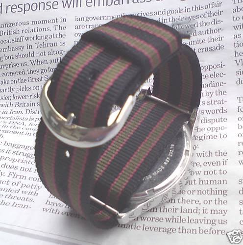
PROJECT UPGRADE: It was my decision, amidst a cluster of 100 degree days, that such a hot time of the year with humidity thick enough to both cut through and choke on, that my groovy new-old vintage Zodiac Spacetronic needed a Summer facelift. In the spirit of the "trad" movement, and with a desire to wear something "lighter", I applied the ribbon band that you see here.


This simple nylon band adds a colorful aesthetic to one's overall ensemble, fits like a second skin around the wrist, and breathes, keeping the wrist cooler than a thicker, more insulating leather strap. Cool huh?

Various colors and patterns are available, but I'd say keep it simple. For a brief time last year, DayGlo colors were popular, a throwback from the 1980's... yeah... remember when Pizza Hut carried the "Back II The Future" sunglasses? That's what I'm referring to. I find the DayGlo movement to be nothing more than a passing trend, just as it was a fad when it first started. Stick to classic colors and avoid lime green, electric yellow, and neon pink.

Lifestyle brand J. Crew sells these ribbon watch bands for around $20 a piece. That's a lot for a piece of nylon. Check out this ebay seller; his bands are $4, with a $2.41 charge for shipping. That's more like it!
One can always go with the ribbon-band "old trusty"... the NATO strap as worn by James Bond with his Rolex Submariner in Dr. No (pictured at left). Be prepared to pay more than $4... I think there's an ebay seller who carries these for around $13.50... I'll let you research that one. Just remember... even though James Bond's Submariner had 20mm lugs, he wore an 18mm band... a little tip for those of us concerned with authentcity.
Until next time,
Cheers!
-Paul

1 comments

Groovy New-Old Vintage Watch, Part I

Hello all. I've spoken before regarding the immense "cool" factor of a nice vintage watch. If you can find one in good condition, without yellowing on the dial and corrosion on the hands, a vintage watch can provide the look of a one-of-a-kind piece that will catch the attention of people you meet day to day.

My newest acquisition definitely fits the proverbial bill. In the 1950's, watchmaker Hamilton started making electronic watches, the most famous of which being the "Ventura" (photo 1). After its futuristic design and initial service problems served to bankrupt the brand, Hamilton was bought out by the Swiss company SSH in 1974 and the Hamilton Ventura design became a brand mainstay that is still produced today, now under the model name "505", which was the name of the original electronic movement. The watch was featured on the wrist of Elvis Presley in "Blue Hawaii", and more recently, the wrists of Will Smith and Tommy Lee Jones in the "Men In Black" films. There are now different movements available in the 505. Most are quartz, and some are automatic.

Electronic watches were the first battery-powered watches, and though the movement still functions very much like a mechanical movement, a battery powers tiny transistors in the watch which regulate the time. The battery replaced the mainspring used in mechanical watches. The electronic watches were considered to be more accurate than mechanical watches had been.

Now, on to my watch! In the 1960's, Swiss brand Zodiac began making electronic watches to compete with those being offered by Hamilton and Bulova's Accutron. The Zodiac electronics boasted more reliable movements than their forebearers, and were able to be made thinner as well. My find is one of these Zodiac models, dubbed the "Spacetronic" (photos 2 & 3). Though originally made in 1968, this one has been very recently serviced and works flawlessly. A picture of the movement (photo 4) is shown as well. Notice that on the dial of the watch, there is no yellowing around the hour markers, which is often seen on older watches as the glue breaks down, and no corrosion on the hands. These are features one should look for when selecting a vintage watch.
A cool thing about the electronic watches is that like on mechanical watches, the second hand still sweeps around the dial, rather than ticking. Very cool. Get on the look out for a cool vintage watch. Ebay is a great source, but some small jewelry stores often have diamonds hidden in the rough.

Until next time,
Cheers!
-Paul

*P.S. As always, please click on photos to enlarge!*

1 comments

Wardrobe Staple: The Black Neck Tie

If you ask any woman what item in her wardrobe is the least expendable (or the most versatile), she will probably volunteer without hesitation that her must-have item is her little black dress. It works for every imaginable event from a dinner date, to a wedding, to a funeral. Men are a little different. Some will claim their navy blazer, others that perfect pair of khakis. Other men will assure you that they must have a solid black neck tie in their wardrobes.

Don't worry; unless you wear it with a black suit, you will not be mistaken for an undertaker, hit man, or a chauffeur. Since black is considered a "neutral" color, most blazers in colors from khaki to navy can be worn with a black tie. It's plain enough to be worn with jeans, yet the dark color makes a black tie ideal for formal events, paired with a killer suit.

Many a man believe the black neck tie to be to funereal in nature, but I disagree. It can show that you mean business, or it can allow for a simple clean line to compliment your ensemble. Width is important. I think that a slim tie is the way to go. Don't be confused. By slim, I don't mean skinny. Reservoir Dogs was a great movie, but we're talking about style here.

My black tie is, at it's widest point, 2.75 inches, which is minimalist in nature, but not trendy. Too wide a tie and you'll look like you earn a second income waiting tables. Too narrow and you'll look like our Reservoir Dogs friends, bumping off jewelry stores. If the width is equal to or less than that of a dollar bill, you're in good shape. If  it's less than 2.25 inches, well... time to cue up the George Baker Selection's "Little Green Bag". Just remember: with the already "stripped-down" look of the black tie, maintaining simplicity is key.


Another tip is to add a little bit of decor to your simple black tie by wearing a tie bar. The tasteful silver flash sets the stark black canvas into relief, and draws attention in a good way. Solid color shirts pair best with the black tie, so think white, blue, or, for the dandies in our midst, pink.

For some extra ornamentation, add a pocket square. This can match the shirt, or for the daring, be the source of pattern for the ensemble. If you stuck with the solid shirt, pattern is good for your square. If your shirt has a pattern, keep the pocket square plain. Otherwise, the shirt-and-pocket square-busy to tie-plain ratio is going to look way off balance.
One can never go wrong keeping all three elements plain and simple, as pictured to the left.

Thanks for tuning in, and until next time,
Cheers!
-Paul

0 comments

A Tight-Knit Community

Hello, all! I must apologize effusively for the unannounced hiatus. There has been a lot going on for me, though it's not worth rambling on about here. Today I wanted to mention an accessory that has been making a huge reemergence in recent years, and the fact that the current season is promoting this item as well leads me to believe that the presence of the silk knit tie is indefinite.

Though obviously available in many colors, I think the first color worth adding to one's wardrobe is the navy blue knit tie. Simple and versatile, this was the tie worn by Sean Connery's James Bond with a beautifully tailored suit, and the texture of the tie also makes it perfect for dressing up a much more casual ensemble (perhaps even one that includes a jet-pack). I like the knit tie in predominantly solid colors. The tactile texture of the tie needs to be balanced with a sparse pallet and too many colors in the tie are distracting.

One of the nice elements of the knit tie is that any season can make the tie look at home. In colder months, the added bulk of the tie implies warmth, but in warmer seasons, the lightness of the silk and looseness of the weave looks comfortable and cool. Wool ties, for example, really work only in the fall and winter months.

One thing that I like to do with textures, and the knit tie is a perfect example, is to pair a visual texture wih a tactile texture for a nice balance. In the pictured example (photo 1), the tactile texture of the knit tie is paired with the visual texture of the shirt's Glen Plaid weave. This shows contrast and at the same time, blends the knit's bulk into the shirt's supporting backdrop.

If the knit tie is not for you, I understand. The squared-off bottom and sock-like appearance are not attractive to some. I myself used to find knit ties tacky looking, partially because when I was younger they seemed so dated to me. Now, however, due to their resurgence, I consider my navy knit tie a staple in my wardrobe. It's one thing that defininitely has a place in my closet's tight-knit community.
Until next time,
Cheers!
-Paul

0 comments

A Little Piece of Americana

I wanted to share with you all a little something I picked up the other day. I was at one of those multi-vendor gift shops... you know the ones; not quite an indoor flea market, not quite a retail store, and not quite a yard sale... something different but strangely reminiscent of each. Some vendors sold antiques, some hand-made jewelry, some books and other assorted knick-knacks.

One glass case caught my eye. It had shelves that rotated with the touch of a button, displaying tie bars and vintage cufflinks and intricate costume jewelry. In the center of one shelf rested my new acquisition. This brass Levi Strauss & Co. belt buckle.

Now, I don't know how old this is... possibly 1970's, but it's incredibly cool and with Levi's new merchandising and design director Erik Joule (the man behind the collaborations with J. Crew, Opening Ceremony and more) continually adding excitement to the brand, I had to buy it. I definitely see old Levi Strauss collectables like this becoming more and more sought after. I had actually left the store and gone home, having been accompanied by one exhausted 4 year old, but when I couldn't get the buckle out of my head 3 days later I went back and rejoiced that it was still there. Mine.

This buckle is the type that one would see on one of those woven Boy Scouts type slide belts, as can be seen from the photo of the back. The problem is that all of the replacement straps I've seen since buying this buckle (including a pack containing 3 interchangable color options actually made by Levi's) are just a bit too wide, so I'll let you all know how it turns out after a visit to the Army & Navy store. Hopefully I'll be able to sport the buckle soon. I tried a leather belt strap that wasn't too wide, but it was far too thick for the hinge mechanism on the back of the buckle. I'll keep looking.

In the mean time, if anyone knows anything about the vintage of this particular buckle, let me know. I think it will be a perfect compliment to my growing wardrobe of heritage American items.
Until next time,
Cheers!
-Paul

1 comments

Style In It's Purest Form


"Do not let others look down on you because you are young, but set forth an example..."

1 Timothy, 4:12

Okay... I know, I'm reaching, here. Forsaking context when quoting scripture. But this Biblical reference popped into my head tonight when my three-and-a-half year-old son approached me tonight with explicit instructions on how I needed to help him get dressed.

It has been snowing today, you see, and my wife asked my son if he'd let her take him walking in the snow. My boy, Benjamin, required very little consideration prior to issuing his reply. "Yes," Ben said. "I'll go get dressed." Benjamin ran upstairs to his room and began preparing himself to brave the cold as my wife did the same in our bedroom. A few moments later Benjamin ran back into our kitchen where I stood cooking, and said "Dad! I need your help!" I turned and looked down to see a very well put-together young man.
I asked him, "Did you pick out your clothes, Benjamin?" "Uhh... yeah," he replied. He may as well have said "duh," but his tone of voice said it loud and clear, so he stuck with the polite response. I asked what I could help him with and Ben explained that he wanted his scarf tied by folding it in half and pulling the two ends through the loop around his neck, so that the scarf's fire truck insignia could be displayed in the empty triangle where his denim shirt was unbuttoned, and since he was already wearing mittens, he needed me to zip up his outer jacket.

I did what he asked, and then looked him over. I realized that I had to take pictures to preserve the first moment where I had been schooled by my kid. My son knew exactly how he wanted his clothes to appear on him. He had his rubber Wellies (with frog faces on them) peeking out from the bottom of his corduroy cargo pants, his denim shirt peeking out from beneath his Lightning McQueen "letter jacket" hoodie, embroidered fire truck on his scarf sitting adjacent to the embroidered car on his jacket... I was impressed.

And then I realized that this kid has grown up watching me get dressed in the morning. He's shopped with me. He's paid attention to the way I've played around with color, and with layering, and with quirkiness. And then it hit me. Damn. This kid's got style. In fact, this is what style is all about. It's not that the outfit in itself is spectacular, but he's three, and here he has assembled an outfit of various articles of clothing all purchased at different times by different people. He put them together in a way that expressed his personality and he knew in his mind's eye precisely what function every component was to serve. He even told me how to tie his scarf. And this is a kid who has no concept of labels and designer branding... just a kid who understands the essence of what works and what doesn't.
We should all be so lucky.
Cheers!
-Paul

4 comments

The Pen Is Mightier... James Bond's Choice

It has been called mightier than the sword. Its use can be attributed to the loss of millions of dollars, the death of millions of people, and the start of millions of dreams. One of the often overlooked accessories that is truly essential to the stylish man is a simple one: the pen. How many times have we had to borrow a cheap Bic Roundstic in order to sign off on a document of great importance, degrading the stylish natures of our signatures, which can be just as recognizable as our faces and may be the simplest testaments of our creativity? I'm sure that the best answer to this question would be "too many."

Carrying one's own pen, loaded with smoothly flowing jet black ink can add ample points to one's cool factor. It can up the appeal of your print, and can be the difference between getting hired for a job and having your application thrown away without a glance. When I was in charge of hiring for a previous employer, I provided a red pen to anyone who asked to borrow one when applying for a job. Applications written in red were not even considered. The long and short of all of this? Carrying your own pen will at some point prove to be the difference between your being taken seriously and being disregarded.

Now, that being said... what kind of pen should you carry? Mont Blanc pens are lovely yet very expensive, but are unarguably one of the most recognizable manufacturers of writing instruments. Their trademark white star prominently adorns the caps of their wares, spurring an instantaneous thought in the minds of those who see it. That thought may easily be, "Hey, nice pen." It may also be "How utterly pretentious." Not worth the risk if you ask me. I want to be taken seriously. I don't want my pen to tell people that I'm a jerk. They should be able to find that out on their own!

All joking aside, here's what I carry: the Parker Jotter (photo 1) . Undergoing very little change since its release in 1954, the Jotter is sleek and it looks professional. It shows that you put thought in carrying a pen with you, but not that you want everyone to know how much your pen set you back. It can be outfitted with gel or rollerball cartridges, and with its brushed stainless steel exterior oozes cool, minimalist style. The Jotter is reliable, doesn't leak, and it isn't bulky.

And the coolest thing about the Parker Jotter (other than its $10.99 price tag)? In 1995's GoldenEye (photo 2) , Peirce Brosnan's James Bond carries one in the pocket of his Brioni suits, proving that a man's stylish pen doesn't have to be proportionate in cost to a man's stylish threads. Now, Bond's pen actually doubled as a class 4 grenade and was a hell of a lot mightier than a sword, so I'm not saying all who carry a Parker Jotter possess the negotiating power of James Bond, but my point is this; Q Branch outfitted Bond with a pen that was functional, befitting of a well-dressed gentleman, and that did not draw unnecessary attention to itself. It is precisely that, gentlemen, that you're looking for.

Until next time,
Cheers!
-Paul

1 comments

Hello, Again...

Dear readers, I write to you today with great embarrassment as it has been 12 days since my last post. I offer my most humble apology; I haven't any excuses, but reasons why abound, including an out-of-town trip and a lot of time in a new administrative position at my day job. Other than this brief contrition, I'd like to jump right back in to things where we left off.


Today I thought I'd touch on plaids. Since we are entering the time when much ado is made about spring, lets hold on to what little bit of the cooler months we have left, shall we?

Very popular this fall/winter season has been the Scottish Black Watch tartan in trousers, scarfs, shirts, and the like. The Black Watch tartan is representative of the 3rd Battalion of the Royal Regiment of Scotland, an infantry batallion whose darkly colored tartan coupled with their charge of "watching" the highlands made way for the coining of the name "Black Watch". The colors look great together, too. Rich greens, blues, and black make the Black Watch perfect for clothing and accessories... at least many designers have thought so this year.


I myself picked up a tie in the Black Watch, and decided to pair it with a shirt with a fine Glen plaid weave. I thought it to be a nice little juxtaposition of patterns, and similar patterns, nonetheless. Photos are included, and the second one enlarges quite nicely!
What makes this plaid on plaid combo work, of course, is the subtle scale of the Glen plaid sitting as a backdrop to the bolder presence of the Black Watch.

Yes, my post is but a tidbit today, and I am going to get back on schedule. Thanks for bearing with me!
Cheers,
-Paul

0 comments

Reader's Question: The Pink Shirt


Reader:
Paul,
I like your blog and agree with most of your opinions, so I decided to ask you a question to get your take on something... the pink dress shirt. I've always stuck to white or blue and have appreciated a more traditional style, but my girlfriend suggested I try pink and I wanted to see if you could offer any tips on how not to look too... "floofy", if you know what I mean. Any advice would be appreciated. Thanks,
Corey S., Chelsea, Massachusetts

First of all, Corey, thanks for writing. You are, believe it or not, the first reader to write in with a question in a year of blogging. I'll take that to mean I must be reaching a broader audience. Far out. In regard to your question, I've long wanted to write a post on the pink shirt, but a couple of other bloggers I respect have done so, so I skipped it. But you, sir, have provided me the perfect opportunity, and consequently I must salute you.

I must first mention that the nature of the color pink whittles away at the security of many a man. It is not bad to feel squeamish about entering foreign territory. But as Jude Law says in the opening of 2004's Alfie, "If you ooze masculinity like some of us do, you have no reason to fear pink". And, yes, I've included the video clip of this opening segment here for your enjoyment. The truth is, pink is actually quite flattering to the complexion of many men. It adds more color to your face and makes you look healthier, and here is a fact that not many folks know: originally, pink was a color associated with little boys, and powder blue with little girls. The reason for this is that pink is derivative of red and suggests masculinity and strength, while blue was thought to be calmer and fairer, suggesting passivity like the fairer sex. It's true. Look it up.

So now I'm sure you're wondering when I'm going to tell you how to wear it. Well, the first suggestion is made by Jude Law's Alfie in the video: wear a pink shirt to spice up an otherwise understated suit and tie combo. A black suit with a dark solid tie makes you look like one of four things when worn with a white shirt; a) a mourner b) an undertaker c) a chauffeur d) a hit man (or Reservoir Dog... take your pick). Wearing a pink shirt adds a bit of personality to an otherwise bland ensemble. Granted, Alfie's character is indeed a chauffeur in the film, but doesn't look like one without his tell-tale cap and Town Car limo. Pink looks great with navy and grey suits as well, again bringing a little spice to the understated and simple.

The other way to wear a pink shirt is to accent it with a complimentary necktie. Now, complimentary doesn't mean your tie has to have pink in it. It can, but shouldn't scream I'm wearing f*ckin' PINK!!!!! Since doubling up on the pink requires a bit of practice and may too quickly nudge at your comfort zone, I'd suggest a tie with some red in it, which is obviously in the same color family without directly echoing the hue. I've included an example using items from my own wardrobe (pictured). In this ensemble, the red flower petals in the tie are complimentary to the pink in the shirt. The navy blue background of the tie corresponds with the jacket. Yes, my pocket square is pink as well, but a simple white cotton or linen square would be fine (pink on pink may require a little experimentation and or practice).

Here are a couple of things to consider, which are of course, my opinion. Don't mix pink with pastel colors outside of the color family, unless you want to look like a f*ckin' Easter Egg. Then you absolutely will look "floofy". Also, according to a good friend with a self-described "unflattering complexion for pink," some African American men cannot wear pink because of their skin tone. Very dark or light-skinned men can, but men who already have a bit of a reddish pigmentation in their complexion can seem to appear overpowered by the color pink. My friend with such a complexion brought this to my attention when I once suggested he wear a pink shirt. "Paul," he said. "I don't wear pink. Tried it. It just doesn't work." Obviously, I would submit to all of you to be the judge of your own complexion issues. But now, I've mentioned it, so it can be food for thought.

Thank you, Corey for writing in. I hope this helped. If there are any other questions you may have, feel free to drop me a line. Until next time, Cheers!

-Paul

2 comments

The Fine Print

Can we all agree that men need to have a little fun every once-in-awhile? Okay... obviously a redundant question. I'm sure we all agree. We all have ways of getting our kicks, both publicly and privately, don't we? Sure, skydiving is a blast. Mountain climbing. Paintball. Streaking, if it's your thing. But certainly, fun doesn't have to come in the form of an activity suited for the X-Games, nor does it have to come at the risk of an indecent exposure charge. Sometimes we are forced to find fun within the confines of life's banalities. Perhaps we like-minded sartorial aficionados try to find fun in getting dressed.

One of my guilty pleasures has always been my almost ritualistic selection of an ensemble the night prior to suiting up for work in the morning. My wife picks on me for it; mentions it at inopportune moments in front of her friends, commenting on my obsessive nature with an accompanying chuckle. But let's face it; she loves it. I can guarantee that she secretly admires my love of clothing... loves having a husband who's fun to go shopping with... one who can objectively help her shop rather than stand around looking at looking at his watch and complaining about having to walk through the lingerie section... I digress. It is during my nightly selection of clothing articles that I look for ways to add a fun, playful element to getting dressed. In doing so the clothing itself becomes almost ancillary to the joy of pairing shoes with a belt or a shirt with a tie.

In difficult times, as many of us now face, we must always remind ourselves to reclaim our joy. Part of the reclamation of my joy lies in the simplicity of possessing the confidence to embrace whimsy, not taking myself too seriously, but being a serious devotee to a lack of the serious. And here is, without further ado, one of my methods.

A playful print tie does not attack the sensibilities of a sartorial enthusiast, but serves to compliment a choice in finery. Now, allow me to clarify; a playful print tie is still professional. A novelty tie, however, is not. Pictures of Santa Claus and bottles of Tabasco sauce, when pictured on a tie, make that tie a novelty tie, which, I'm sorry, but no well-dressed man should ever wear. I understand having such a tie in one's closet; such items are commonly bestowed upon men by their children on Father's Day and such. Throwing the gift away would be just plain wrong. Almost as wrong as actually wearing it. Do you get my drift? Okay. I will proceed.

A playful print tie, such as this one by Hermes (pictured) injects an outfit with a spirit of fun through it's subject, but maintains structure and professionalism in the quality of its construction and the geometric perfection of its repeating pattern. Salvatore Ferragamo, Charvet, Burberry, and Gucci are also known for their high-quality printed ties. Now why, you ask, should printed ties be considered rather than woven ties? Well first of all, the added thickness of a woven pattern can add bulk and can sometimes make for a more chunky knot. Not necessarily a bad thing with a cheap tie, but with a tie that is already made with substantial heft and balance due to the use of high-quality silk and a densely folded construction, the added substance can make even a four-in-hand knot look curiously large.

Secondly, the vibrance of color that can be seen in a print can be lost in the makeup of a weave. The pictured tie is a great example. The rabbit's blues gleam and the white in the sparkles at the tips of the magic wands almost seems to glow. The three-dimensional element of a woven pattern breaks up light and takes the focus off of the color. A printed tie can be busier than a woven jacquard without looking like there is too much going on.

Keep in mind that the idea of the tie here is just an example of the true point of this post. We're talking about fun. We're talking about reclaiming our joy. I will reitterate that the clothes or the shoes or the ties ar what have you are ancillary to the fun that we can have with the things we love. I hope you've been inspired in one way or another. Have fun. As famous journalist Helen Thomas once said, "Life is too short to drink the house wine." As I say; "Live accordingly."

Cheers.
Paul