I am so incredibly excited that Fall is here. It is, in my opinion, the most opportune of times for men's fashion, and gives us all a chance to amp up our style game. The crisp lines of summer fabrics can be traded out for layers of soft, tactile fabrics like wool, cashmere, and velvet (yes, velvet... but that's for another post!). In the early days of Fall, a day that begins in the 50's or 60's can easily work its way up to the mid to upper 70's, and then drop to the 40's by nightfall. This is why layering should be your secret weapon.
The look depicted today is just an example of layering tactics. Experiment on your own, and as it gets colder, the items will certainly change. What you see here today will almost definitely be accompanied by a trenchcoat when cold rainy days come, and the blat of khaki color will compliment the current ensemble. But don't let me get carried away with myself. Let me explain today's look.
The Shirt: The Oxford Cloth button down is the perfect Fall shirt. A little bit heavier than cotton broadcloth, the OCBD has a little heft to it, which serves well to stifle the cutting effect of a cold breeze.
The Jacket: Some say that everyman's wardrobe needs a navy blazer. I have two; one of a light-weight tropical wool for warmer months, and one (pictured) of a heavier cashmere-wool blend for the cooler months. This jacket goes with everything from jeans to tailored trousers, and works great as a layering piece. In Fall and Winter I tend to go for the more pronounced pocket square, again breaking away from the crisp, pressed lines of summer. The square adds some punch.
The Layer (Cardigan): A cotton cardigan makes for an ideal layering piece, because it is relatively light-weight. In early Fall, between the wool blazer and the OCBD shirt, only a slight bit of extra insulation is needed around the midsection. As you can see in the picture, this one is short-sleeved, which is perfect as the day warms up. At this point, one has the option to ditch the jacket and roll up the sleeves, as shown, or ditch the cardigan and put the blazer back on. I just love having options!
The Tie: I chose a bowtie for this look not just because of the color combinations I am wearing, but because A) Bowties are BIG this season (finally!!!), and B) I enjoy the preppy aesthetic that the bowtie lends to the casual nature of the outfit I chose.
The Jeans: In Fall and winter, a darker jean is preferable. In Spring and Summer one can lighten up a bit to shake the winter blues, but colder months call for a darker, somber color, like these that sport a deep indigo wash. Again, I chose jeans to flirt with the less casual looking, preppy above-waist look.
The Shoes: The brown wingtips. Again, I have two pair of these. One is a deep chocolate brown that I keep immaculate, and the other are these, which are lighter in color, and I let them get a little beat up, just to shake some polish from a casual outfit. Wingtips are great for Fall. Period.
The Extras: This outfit illustrates perfectly the extra flair that a nice umbrella can lend you, as I mentioned in the last post. Here in Charlotte, NC, the weather forecasts have been changing daily. A day that calls for no rain suddenly becomes a sling-fest of cats and dogs. In the particularly fickle early days of Fall, a sweet-looking umbrella just always works.
If one does remove the jacket and roll up the sleeves, one should wear a watch with heft, which compliments a layered look. Chronographs are cool. I tried to keep the color scheme in line with the shoes, since I'm otherwise bathed in reds and blues. Chunky. Brown. Bold. Bitchin' and BadAss.
Enjoy the season for layering. Enjoy the season to kick your style game up a notch. Enjoy soft, luxurious clothing. Enjoy the Fall.
The longer I keep up my work as a style blogger, the more I realize that others doing the same thing are being sent free swag to review on their sites. I've done several reviews and haven't been sent anything free yet, so to all of you fine purveyors of stylish goods out there, keep me in mind!
All joking aside (I was only half serious), I wanted to plug a product today that I bought because of the color and ended up falling in love with. It's a pair of chinos, and after my friend Mxolisi over at Perfect Gentleman blogged about a pair in the same color, I realized that all of my khaki chinos were more of a pale stone color and that my wardrobe was definitely lacking a pair in this sage brown / terra cotta hue.
I came across these pants by accident while I was at Target. I don't typically think of shopping at Target for clothing, but damn it if the color of these khaki chinos wasn't exactly what I was looking for. They are made by Target's exclusive brand, Merona, and the label proclaims their status as "The Ultimate Khaki." I didn't have time to try them on, so I took a gamble and bought them, figuring I could always come back later and exchange them for a bag of diapers or something else I would surely need.
When I finally tried them on, I was surprised. They fit exceptionally well. In fact, they may fit better than any off-the-rack pair of chinos I've ever bought in my supposed size, which no two makers seem to be able to agree on cutting the same way. The pants are 100 % cotton, flat front and slim cut, and according to their tag, shrink resistant, wrinkle resistant, stain repellent, and the cotton is made with what is referred to as "Nano-Tex" technology that repels spills and releases soil from the fabric when washing. Sounds pretty cool.
The size is great. I just hope that they are as shrink resistant as the tag says they are.
At any rate, the pants get high marks from me. I personally think that every man needs at least one great fitting pair of flat front khaki chinos. Just look at what icons like Miles Davis and Steve McQueen did with just that one article of clothing. The versatility is paramount. Merona's Ultimate Khakis are constructed well, fit beautifully, and at only $19.99 a pair, are quite affordable. Try a pair on and see what you think. The Ultimate Khakis come in several shades as well, from the pale stone color to the deeper brown sage / terra cotta color that I ended up with. The ones that I am wearing here are actually a lot more golden in color than the pictures show.
You know, say what you will about George Michael, but the man knows what people want to see. His gift for capturing a viewer's attention and playing with one's senses is uncanny. I was at a posh uptown party last night and found myself in a high-rise condominium overlooking the Charlotte skyline, which may very well be the coolest bachelor pad I've ever seen. I'm not going to go into too much detail except to say this: there was a laser/light show and a big TV mounted above the room playing music videos. One of the DVDs that the host put in featured music videos by none other than George Michael.
I thought this to be a pretty bold move at first, given the whole "lewd act" thing of a few years back, but considering that this particular condo probably got our host loads and loads of female... shall we say... attention, I watched. And watched. And realized that I'd forgotten how stylish this man's music videos were. Incredible attention is paid to color and movement, and even the shape of the models faces and hair styles contibute to the visual aesthetic of George Michael's music videos. Each frame of every video could make for an impressive photograph.
Check these examples out and see what I mean and you'll realize it too; the man has taste. Cheers!
I was pleased when I picked up my warm-weather blazer from my tailor last week. In addition to a few fitment tweaks that are occasional necessities from season to season, I had him apply some lovely mother-of-pearl buttons to the jacket in lieu of the traditional polished brass jobbers that I don't exactly fancy. The results are lovely, although the photograph (photo 1) does not exactly capture the subtle nuances of the lustre of the M.O.P.
I put together a casual spring ensemble as well showcasing the jacket (photos 2 & 3) to try and illustrate the versatility of the lighter buttons. The blazer can, of course, also be worn in any other circustance where one would wear a navy blazer, be it with khakis and a button-down collar shirt for an old-school preppy aesthetic, or with dressier grey trousers and a tailored spread collar shirt for more formality. As shown here, the less conventional M.O.P. buttons allow the perfect "reason" for the blazer to accompany a more casual ensemble, and dress up casual wear without appearing too pretentious.
In photo 2, notice the brightly colored shirt under the plaid button-down. This shirt accents some of the color in the plaid, but also allows for a nice layering of colors, an effect achieved by the luminescent buttons first, followed by the colorful plaid, and finally the brightly colored "under" shirt. Note also the pocket square, which, in the wake of the casual wear returns a little bit of "respectablility" to the blazer. This ensemble is not designed necessarily to be the point behind the post, but I'd previously mentioned a follow-up to the last reader's question post about spring-wear and wanted to include some images that might inspire ways to let that blazer with M.O.P. buttons shine this spring. Ultimately, I'd love to see some reader's looks that make use of white buttons as well. Send any pictures of your inspired outfits for spring on to me and we'll get them posted.
Paul- Thanks for keeping this blog going. I Enjoy it very much. I am seeing a lot of advertising for the Spring 2010 wardrobe already. I feel like I just got done buying for fall and winter and am a little overwhelmed. Is there a simple way to make some of what I already have more oriented toward spring without buying a whole new wardrobe? I have a navy blazer that I wear a lot, and it's an all-season fabric. What can I wear with this to look like I'm keeping up? Thanks, Nate P. -Auburn, Georgia Thank you, Nate, for writing in. You pose a terrific question. I too have my regrets about the dawn of a new season. I always look forward to fall and winter, especially because of the way this time of year lends itself to layering colors and textures. I always find myself excited when spring is around the corner, because I get to break out some of the things that have just been hanging around in my closet for six months, but then I become quickly bored with the warmer weather and feel like I have to buy more stuff.
Now that we are in a recession from hell thanks to frivolous government spending and the transference of the burden onto the American taxpayer, "buying more stuff" is becoming less and less of an option. The nation is stressed and its people are strapped. It's time to "re-purpose" your already existing wardrobe. Here is one thing I have in mind, regarding the navy blazer you mentioned.
I assume when you said that your blazer is constructed of an "all-season" fabric that it is a tropical wool or a cotton blazer. I have one of these, too. Because I have a heavier worsted wool blazer which I wear in colder months, I typically reserve my tropical wool blazer for spring, summer, and early fall. When I got it it was, of course, adorned with shiny brass buttons. I'm not a big fan of brass buttons, as cheap and expensive blazers alike bear them, so I like something a little different to make my jacket more unique. My cool weather blazer sports antique silver buttons. My tailor is currently tweaking my spring wardrobe, and I'm having him add white mother-of-pearl buttons (see photo 1) to my warm weather blazer (yes, the one pictured has a hole in it where the pearl was over-polished. That's why I have it to photograph and my tailor doesn't have it to attach to my jacket!).
I suggest this for you as well. You can always change the buttons back when the weather gets cooler again, or you can leave them as is, but white buttons can be found for little expense and will completely change the look of your blazer. I will post pics of the finished product when I pick the blazer up, but for now, here is a pic (photo 2, borrowed from The Sartorialist) of a gentleman rocking the navy blazer with white buttons. As you can see, this lightens up a wardrobe staple and gears it toward the warmer season.
As far as the advertising for Spring 2010 goes, on this blog I try to focus more on enduring style rather than what is being pushed in the fashion world. Anything that I suggest is going to be geared more towards consistency and timelessness. I will talk about "Spring", but not about a particular year. We want to be able to "build" a wardrobe, and not to cycle things out season after season. Now certain colors, for example, may be used more by designers in a particular year, and at that point, wearing a tie or scarf comprised of "in the now" colors will make all of the timeless elements of your wardrobe look more current. That's cool. But trends should be avoided like the plague. The Day-Glo colors that were popular last spring? Done and gone. Popular when Back to the Future II came out, and then popular last year. Try to focus more on what will look good each spring rather than this spring. The white blazer buttons are a perfect example.
Add light colors to your ensemble by way of ties and pocket squares. A pair of white chinos would be a good thing to invest in for the spring and summer as well, as they will work with every thing from your navy blazer to a t-shirt and boat shoes (photos 3, 4, and 5 attest to their versatility... these photos are also property of The Sartorialist). With maybe one or two new purchases, what you have will work wonders for you. Start by hunting down some new buttons. Let me know how you do! Cheers!
Dear readers, I write to you today with great embarrassment as it has been 12 days since my last post. I offer my most humble apology; I haven't any excuses, but reasons why abound, including an out-of-town trip and a lot of time in a new administrative position at my day job. Other than this brief contrition, I'd like to jump right back in to things where we left off.
Today I thought I'd touch on plaids. Since we are entering the time when much ado is made about spring, lets hold on to what little bit of the cooler months we have left, shall we?
Very popular this fall/winter season has been the Scottish Black Watch tartan in trousers, scarfs, shirts, and the like. The Black Watch tartan is representative of the 3rd Battalion of the Royal Regiment of Scotland, an infantry batallion whose darkly colored tartan coupled with their charge of "watching" the highlands made way for the coining of the name "Black Watch". The colors look great together, too. Rich greens, blues, and black make the Black Watch perfect for clothing and accessories... at least many designers have thought so this year.
I myself picked up a tie in the Black Watch, and decided to pair it with a shirt with a fine Glen plaid weave. I thought it to be a nice little juxtaposition of patterns, and similar patterns, nonetheless. Photos are included, and the second one enlarges quite nicely!
What makes this plaid on plaid combo work, of course, is the subtle scale of the Glen plaid sitting as a backdrop to the bolder presence of the Black Watch.
Yes, my post is but a tidbit today, and I am going to get back on schedule. Thanks for bearing with me!
Reader: Paul, I like your blog and agree with most of your opinions, so I decided to ask you a question to get your take on something... the pink dress shirt. I've always stuck to white or blue and have appreciated a more traditional style, but my girlfriend suggested I try pink and I wanted to see if you could offer any tips on how not to look too... "floofy", if you know what I mean. Any advice would be appreciated. Thanks, Corey S.,Chelsea, Massachusetts
First of all, Corey, thanks for writing. You are, believe it or not, the first reader to write in with a question in a year of blogging. I'll take that to mean I must be reaching a broader audience. Far out. In regard to your question, I've long wanted to write a post on the pink shirt, but a couple of other bloggers I respect have done so, so I skipped it. But you, sir, have provided me the perfect opportunity, and consequently I must salute you.
I must first mention that the nature of the color pink whittles away at the security of many a man. It is not bad to feel squeamish about entering foreign territory. But as Jude Law says in the opening of 2004's Alfie, "If you ooze masculinity like some of us do, you have no reason to fear pink". And, yes, I've included the video clip of this opening segment here for your enjoyment. The truth is, pink is actually quite flattering to the complexion of many men. It adds more color to your face and makes you look healthier, and here is a fact that not many folks know: originally, pink was a color associated with little boys, and powder blue with little girls. The reason for this is that pink is derivative of red and suggests masculinity and strength, while blue was thought to be calmer and fairer, suggesting passivity like the fairer sex. It's true. Look it up.
So now I'm sure you're wondering when I'm going to tell you how to wear it. Well, the first suggestion is made by Jude Law's Alfie in the video: wear a pink shirt to spice up an otherwise understated suit and tie combo. A black suit with a dark solid tie makes you look like one of four things when worn with a white shirt; a) a mourner b) an undertaker c) a chauffeur d) a hit man (or Reservoir Dog... take your pick). Wearing a pink shirt adds a bit of personality to an otherwise bland ensemble. Granted, Alfie's character is indeed a chauffeur in the film, but doesn't look like one without his tell-tale cap and Town Car limo. Pink looks great with navy and grey suits as well, again bringing a little spice to the understated and simple.
The other way to wear a pink shirt is to accent it with a complimentary necktie. Now, complimentary doesn't mean your tie has to have pink in it. It can, but shouldn't screamI'm wearing f*ckin' PINK!!!!! Since doubling up on the pink requires a bit of practice and may too quickly nudge at your comfort zone, I'd suggest a tie with some red in it, which is obviously in the same color family without directly echoing the hue. I've included an example using items from my own wardrobe (pictured). In this ensemble, the red flower petals in the tie are complimentary to the pink in the shirt. The navy blue background of the tie corresponds with the jacket. Yes, my pocket square is pink as well, but a simple white cotton or linen square would be fine (pink on pink may require a little experimentation and or practice).
Here are a couple of things to consider, which are of course, my opinion. Don't mix pink with pastel colors outside of the color family, unless you want to look like a f*ckin' Easter Egg. Then you absolutely will look "floofy". Also, according to a good friend with a self-described "unflattering complexion for pink," some African American men cannot wear pink because of their skin tone. Very dark or light-skinned men can, but men who already have a bit of a reddish pigmentation in their complexion can seem to appear overpowered by the color pink. My friend with such a complexion brought this to my attention when I once suggested he wear a pink shirt. "Paul," he said. "I don't wear pink. Tried it. It just doesn't work." Obviously, I would submit to all of you to be the judge of your own complexion issues. But now, I've mentioned it, so it can be food for thought.
Thank you, Corey for writing in. I hope this helped. If there are any other questions you may have, feel free to drop me a line. Until next time, Cheers!
Can we all agree that men need to have a little fun every once-in-awhile? Okay... obviously a redundant question. I'm sure we all agree. We all have ways of getting our kicks, both publicly and privately, don't we? Sure, skydiving is a blast. Mountain climbing. Paintball. Streaking, if it's your thing. But certainly, fun doesn't have to come in the form of an activity suited for the X-Games, nor does it have to come at the risk of an indecent exposure charge. Sometimes we are forced to find fun within the confines of life's banalities. Perhaps we like-minded sartorial aficionados try to find fun in getting dressed.
One of my guilty pleasures has always been my almost ritualistic selection of an ensemble the night prior to suiting up for work in the morning. My wife picks on me for it; mentions it at inopportune moments in front of her friends, commenting on my obsessive nature with an accompanying chuckle. But let's face it; she loves it. I can guarantee that she secretly admires my love of clothing... loves having a husband who's fun to go shopping with... one who can objectively help her shop rather than stand around looking at looking at his watch and complaining about having to walk through the lingerie section... I digress. It is during my nightly selection of clothing articles that I look for ways to add a fun, playful element to getting dressed. In doing so the clothing itself becomes almost ancillary to the joy of pairing shoes with a belt or a shirt with a tie.
In difficult times, as many of us now face, we must always remind ourselves to reclaim our joy. Part of the reclamation of my joy lies in the simplicity of possessing the confidence to embrace whimsy, not taking myself too seriously, but being a serious devotee to a lack of the serious. And here is, without further ado, one of my methods.
A playful print tie does not attack the sensibilities of a sartorial enthusiast, but serves to compliment a choice in finery. Now, allow me to clarify; a playful print tie is still professional. A novelty tie, however, is not. Pictures of Santa Claus and bottles of Tabasco sauce, when pictured on a tie, make that tie a novelty tie, which, I'm sorry, but no well-dressed man should ever wear. I understand having such a tie in one's closet; such items are commonly bestowed upon men by their children on Father's Day and such. Throwing the gift away would be just plain wrong. Almost as wrong as actually wearing it. Do you get my drift? Okay. I will proceed.
A playful print tie, such as this one by Hermes (pictured) injects an outfit with a spirit of fun through it's subject, but maintains structure and professionalism in the quality of its construction and the geometric perfection of its repeating pattern. Salvatore Ferragamo, Charvet, Burberry, and Gucci are also known for their high-quality printed ties. Now why, you ask, should printed ties be considered rather than woven ties? Well first of all, the added thickness of a woven pattern can add bulk and can sometimes make for a more chunky knot. Not necessarily a bad thing with a cheap tie, but with a tie that is already made with substantial heft and balance due to the use of high-quality silk and a densely folded construction, the added substance can make even a four-in-hand knot look curiously large.
Secondly, the vibrance of color that can be seen in a print can be lost in the makeup of a weave. The pictured tie is a great example. The rabbit's blues gleam and the white in the sparkles at the tips of the magic wands almost seems to glow. The three-dimensional element of a woven pattern breaks up light and takes the focus off of the color. A printed tie can be busier than a woven jacquard without looking like there is too much going on.
Keep in mind that the idea of the tie here is just an example of the true point of this post. We're talking about fun. We're talking about reclaiming our joy. I will reitterate that the clothes or the shoes or the ties ar what have you are ancillary to the fun that we can have with the things we love. I hope you've been inspired in one way or another. Have fun. As famous journalist Helen Thomas once said, "Life is too short to drink the house wine." As I say; "Live accordingly."
Hello again all. I hope the Thanksgiving holiday was wonderful for all of you. The ensuing holiday chaos coupled with my charge of leading sales training seminars last month made my writings sparse, and I offer my most humble apology. I am now trying to get back into regular postings, so thank you for bearing with me. I figured I would start off December with the mention of a look that I've seen quite a lot this season, and after trying it out, I think the look works great!
Dress up the plaid shirt. With a suit or a nice blazer or sport coat, the right plaid shirt and tie combo is great for injecting color into an ensemble. With a suit, basic navy, black, or gray works best. Since the pattern in the shirt is pretty bold, one should abstain from a patterned suit, be it stripes or checks, regardless of pattern scale. You don't want to look like an optical illusion. With a sport coat, a faint pattern works, but the tie and the pants should be solid to balance out the look and avoid a case of ocular malaise... unless you want to look like a patchwork quilt.
When the pants and jacket are solid one can sport a patterned tie, but again, the busy nature of plaid requires an ode to minimalism. Bold stripes or a repeating logo should be the extent of the pattern. Stick with a dark tie and pick up one of the colors from the shirt, as I've done with navy in the pictured examples (click for large images). Have some fun with it though. The look works, so make it work for you.
Hello again! Sorry; it has been a few days since my last post. Life has been busy. What can I say? My nine-week-old daughter got some shots and has been depressingly puny for the better part of the week, and as our doctor protests mine and my wife's strong stance against unnecessary vaccinations, there are still a few that must be administered, even under our own admission. Anyhoo...
Today we will again discuss the pocket square. I am a big pocket square advocate and fan, and I have many brightly colored silk pocket squares that I love to wear to amp up an outfit. Lately however, possibly because of the Mad Men influence, I have been favoring the snow-white cotton or linen square, pressed in a crisp TV fold, gently peaking out from above my pocket. The James Bond fold, where 1/8th to 1/4 of an inch of square politely asserts its presence, breaking the monotony of an otherwise conservative (eh... maybe not so conservative) ensemble.
I have, however, started to wonder what is wrong with me, the proverbial semi-dandy, whose collection of vibrant pocket squares has begun to virtually gather dust. I decided something must be done, and a happy medium had to be reached. Enter the patterned cotton handkerchief. Simple in its medium of construction, not unlike the plain white handkerchief that has become a staple, but slightly ballsy, displaying a tasteful pattern on its empty canvas.
Photo 1 shows a couple of examples, designed by David Chu of Nautica notoriety, one with a plaid pattern and one with a tasteful stripe. Pairing one of these squares with one's outfit pays an homage to minimalism, while at the same time projecting flair and panache. In photo 2, the pocket square echoes colors in the shirt with the lighter blues, and also the darker navy in the crest on the rep tie, brilliantly tying the components together. The plaid pattern also flirts with the sport coat's windowpane.
This example is not a limitation. My good friend David Watkins of Astor & Black custom clothiers recently wore a pocket square cut from the same fabric of one of his custom shirts, in a white undercolor with brown micro-check, paired with a brown tie. Combinations obviously abound, and pairings can include jacket pattern, shirt, tie... you get the idea.
The nice thing about these squares? Cheap. A box of 3 can typically run you around $20 at sources such as Brooks Brothers or department stores. Or, check out the outlet stores. A box of 3 patterned squares at TJ Maxx, for example, may be priced as low as $5.99. Give it a try, and until next time, Cheers! -Paul
Well here they are, in the flesh. These shoes fit true to size, and are very, very comfortable. The insole, shown in photo 2, has the perfect amount of padding and provides an excellent cushioning effect when walking. The suede uppers are soft and supple. All-in-all, a great bang for the buck.
I did shorten the laces, which were quite long, and I still feel the need to take them out and dye them red. The contrast of the white lace on the soft red upper may appeal to some, but I believe I'd like a more uniform appearance. The red of the shoes is a nice balance between brick red and pink; my one reservation about dying the white leather laces is that they may turn out more pink looking, and therefore upset the balance of the overall shoe color.
The pebbled soles of the shoes, similar in appearance to those of Tod's (despite the absence of a few "pebbles"), provide excellent traction on slightly uneven ground. Granted, these are not an "outdoor" shoe, but the presence of a rubber sole makes wearing the shoes outside safer on the suede.
I look forward to peoples' reactions to these shoes. I'm sure I'll enjoy experimenting with appropriate pairings and discovering ways to wear them. If the red driving shoe is for you, my thoughts are that you will be well pleased with the price, quality, and comfort of this pair.
I have a pair of driving mocs in chocolate brown suede. I picked them up from Banana Republic about a year ago. They are constructed rather well, except for the fact that the man-made insole causes one's feet to sweat and slide around in the shoe when going sockless. The problem was solved by purchasing some of the small loafer booties offered by such retailers as Banana Republic or Journey's (although Target sells them for a much lower price in the women's hoisery department, in a large size that accomodates a male foot). The lesson learned here was to buy a loafer with a soft leather insole: no sweating, and consequently, no sliding.
In the Spring of this year, Esquire magazine published their now semi-annual Big Black Book of men's style, and featured a driving loafer in a spread about Italian style (pictured, left). What got my attention about these loafers was their color. Bright red. Nice. After several months of not being able to forget how freakin' cool these looked, I decided I had to get a pair. Suddenly, a new problem presented itself: $$$$$$! The Car Shoe brand driving loafers featured in Esquire go for $420 bucks! Major drat. I looked around and found that Tod's makes a pair as well. $450 bucks! While I may have some $400 shoes in my closet, none of them have a novelty element to them (such as a bright red finish) that would limit my ability to wear them with everything. I'm willing to fork out some coin for versatility, but I can't justify such an expense on a driving moc.
Then, I found these (photo 2). Shoe manufacturer Born makes a red driving loafer (the Lynch) for just a value meal over $100. SOLD! These have an attractive appearance, a leather insole, and are constructed using the Opanka hand-sewn technique, where the upper, the padding, and insole are sewn together in a single process. Sounds good to me.
Now these shoes have been featured on some other blogs; most notably Tweed & Velvet (there is a link in my Blog List), and I haven't received mine yet, so after they arrive I promise a review. One thing that I may do is remove the laces and dye them red for a more uniform appearance... I think the white laces may be slightly distracting from the overall effect. We shall see. It's nice to have the prospect of a comfortable pair of driving shoes. If these work well, I may have to invest in some of the other color options that Born has available. The navy pair looks nice too. Check out the available Lynch models on Born's website, through the link here. http://tinyurl.com/born-lynch
It's Fall now guys. The air is cool and crisp, and our car consoles are pumping out heat instead of air conditioning. One of the most beautiful things about Fall, aside from the lovely changing of the leaves and the smells of cold air and dying foliage (yeah... it smells good), is the ability to add some presence to our outfits by layering. It's colder, and warmth is a good thing, but staying warm in style brings an extra something special to the table. One of the best ways to keep showing off your well selected tie and perfectly spread shirt collar is the v-neck sweater, or, for those who are slightly more daring, the zipper-neck sweater. The zipper neck allows the freedom to pop the collar as pictured, or to tuck it under for a more subdued statement. Keep in mind that tucking the collar under the jacket could cause a bit of a lump or gap at the back of your jacket collar: if this is a problem, a v-neck may be a better option for you. Choose a sweater that is thin and delicate, constructed of a fine fabric such as cashmere or merino wool, so that when worn under a sport coat or blazer one doesn't add to much unnecessary bulk to the torso. The idea is to stay warm, but not to look like a climb up Mount Everest is on the daily agenda. Adding such a layer allows one the opportunity to be even more playful with colors. Note the example pictured, where the navy blue sweater is echoed by the navy blue in the pocket square, and the navy is also complimentary to the blue stripes in the shirt. Textures are somewhat repeated as well; both the sweater and the blazer are cashmere, so that even with bold patterns there is an anchor of consistency by way of fabric selection. Get creative, have fun, but use the colder months as a chance to experiment with layering. Until next time, Cheers! -Paul
Hello again! Today we return after many posts, to the topic of the pocket square. I've touched on pocket squares before, but have never covered the basics of proper square selection and decorum. The pocket square was for years a forgotten accessory, and I'd still consider it to be one of the most underrated. The breast pocket in a jacket was designed to display one, and having an added dash of color on your chest can do wonders for your overall appearance.
Now, with the advent of the Mad Men era, style is returning to the days of old, and many men are rediscovering the pocket square. Some choose to go for a crisply folded white square (Mad Men style), which always works well for providing contrast to an ensemble, allowing one's collar, cuffs, and square to break the visual monotony of the jacket. When straying from white, however, many men execute the wear of the square poorly. Mistakes are easily made, and I'm hoping that my two cents can help some folks avoid the pitfalls of square wear.
First of all, if you ever end up buying a pocket square and tie that come as a set, do not wear the two together. I would recommend refraining from buying these sets all-together, because in most circumstances, the ties are poorly made. A square/tie set always screams bargain basement to me, and those who know clothing and see you wearing an obvious set will think the same thing. Choose a square that is complimentary to your tie, but different (photo 1). In the pictured example, the colors are the same, but it is obvious that the tie and square are cut from different cloths.
Another method involves choosing a square to compliment a pattern in a suit (photo 2). In this example, the blue and gold pinstripe in the suit are echoed in the pocket square. The green base color of the pocket square is in the family of both the blue and the gold. The tie is complimentary here as well, with blue and orange accent colors.
Finally, the most daring approach involves pairing your pocket square with neither the tie or jacket, but with a color in the shirt (photo 3). In this case, one needs to look at the pocket square as a sort of second necktie, independent of the actual necktie. You follow? If you didn't have on the tie that you are wearing, would the colors of the pocket square serve in a necktie. In the pictured example, the actual tie compliments the cranberry colors in the jacket, and the pocket square compliments the undercheck of the shirt. Not everone will be comfortable with this type of pairing, but when you are able to put an outfit together in this manner it shows that you are looking at dressing as an artform, and not simply as a means of covering your rear end.
This post could go on and on; this is a simplified explanation of wearing the pocket square, but I am hoping that it's just enough to get you thinking and to jump-start the creativity of the man and his wardrobe. Try it out, take some risks, and be creative!
Alright! Autumn has arrived; the season fashionistas everywhere wait for all year... the most versatile season when equal comfort can be found in a T-shirt and shorts or a lightweight sweater under a blazer (see previous post). Layers can be shown off easily- the weather's right for it, unlike in the winter time when bundling up conceals your carefully selected ensemble.
Out of all the options that open up for dressing during this glorious season, there is one quintessential fabric for fall that we must touch on today; that fabric, my friends, is tweed. The color pallette of tweeds can echo the lovely changing leaves of autumn with rich rust and brown colors (photo 1) or can epitomize the briskness of the air with cool blues and grays (photo 2).
Tweeds are ideal for layering, available in many weights and thicknesses of fabric. They can keep you warm and wick away moisture, thanks to the amazing qualities of wool, which make up the fabric. Tweed, by definition, refers simply to a weave of wool, but today we will touch (ever so slightly) on the history and heritage that has kept tweed a stylistic staple for many, many years.
In Scottish Gaelic, the name for tweed was an clo mor, which means "The Big Cloth," referring to the layers of various texture and pattern that make up the wool's weave. Designed to be, effectively, one of the earliest forms of camouflage, landowners in Scotland commissioned tweed fabrics to outfit their gamekeepers (and themselves alike) during deerstalking and hunting. The patterns' colors were reflective of rock formations and foilage that decorated the surrounding landscape of landowners' respective estates. Landowners often had gamekeepers run up on the hillside with samples of proposed fabrics to see which one blended in better with nature's decor. This is how the multitude of variances of tweed patterns came about.
One variation of tweed that is quite popular this season, is the herringbone design. The simple twill (twill: a term for a woven pattern created by raising and lowering alternating warp threads in various combinations) of the herringbone design has been around for thousands of years, and looks very much like the skeleton of a fish (get it? Herring... Bone...). Different 2-color combinations can comprise a herringbone pattern, but usually a black or gray and a lighter color combine to create a rich, textured look when viewed up close (photos 3 and 4, below). As I conclude our very brief history lesson, keep in mind that many popular tweed patterns exist, all with their own history, but focusing on the multitude would turn this post into far too detailed of an essay, which is not what we're trying to achieve here. What I want you to take away is the versatility of the fabric in composing your style. The availability of color and pattern can be the perfect pallette for pairing accessories with an outfit, be the accessory a necktie, a pocket square, a shirt, a zipper-neck sweater as a layering piece... the possibilites, given the variations of tweed prints, are virtually endless. Take inspiration from the beauty of the season (and the majesty of The Big Cloth), and embrace the possiblities. Until next time,
I met a woman today who's style caught my eye. I was at my day job and she was a customer, so I abstained from a full-length shot... conflict of interests and what not. Before she left, however, I asked if she'd mind my photographing her watch/bracelet combo.
She was dressed nicely, with a form-fitting black knit shirt and some dark- wash skinny jeans. All in all, the outfit employed a very dark color scheme. There was a little bit of ivory in her shoes, which, along with stripes of black, made up a very minimalist thong design. The big "black breaker" was in her watch, shown above (please click the image to see full size). She told me she had purchased both the watch and bracelet in New York City. I love the subway theme of the watch. In retrospect, I wish I had taken another picture to capture the band, which traced subway routes in bright colors against a shiny black plastic backdrop.
I was also impressed with her wearing of the watch with the chinese beaded bracelet. Cary Grant wore a thin gold chain bracelet with his watch, and I used to wear my bracelets on the same wrist as my watch as well... that is until I noticed the finish on a Rolex getting scratched and dull looking: not a viable tradeoff for fashion, in my opinion. A bracelet can be a very classy and tasteful accessory to a watch, and even if it seems a little bit more acceptable on a woman, the bold, chunky bracelet in the pictured example suggested a little bit of rebelious style.
A great point to take away from this post is the importance of breaking black. Through all of its darkness and neutrality, black clothing begs for one colorful accessory to scream out, "Here I am!" The key is not doing it ostentatiously. The subtle injection of color is a delicate art and can easily be overdone. I think the pictured example perfectly illustrates restraint and class. This combo works. And it works well. I don't know that this delightfully colorful watch would work as well without the bracelet as its pairing. The colors in the watch, which our stylish lady must have worn with the intent of injecting some color into her ensemble, are kept at bay and restrained by more black, this time in the bracelet. Superbly done. Mrs. _______, I salute you. Until next time, Cheers! -Paul
Rep ties were originally designed to show one's affiliation with an Ivy League school. Each school had a tie that was like a unique coat of arms, symbolizing years of heritage and tradtition. Today, rep ties have become a stylistic staple, able to throw a quirky "prep-school" vibe to an otherwise conservative ensemble, or to playfully dress up jeans when worn with a dress shirt.
Many tie-makers design rep ties now that may or may not have any school "ties" (pun intended), but that definitely amp up a wardrobe. Have a few in your collection. I personally think that rep ties work best in transition seasons, such as spring and fall, so now is the perfect time to break one out! Pictured is a more dressed up example, but you can dress one of these ties down just as easily to bring out the colors in a pocket square or socks.
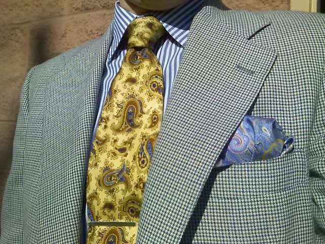
Today I wanted to touch on patterns and colors, and how to balance very different visual and tactile textures.
When mixing patterns, it is quite easy to end up looking like an optical illusion, so one must take care in choosing articles that are not too combative in nature.
In the example seen below, a "base" is achieved with a rather common patterned shirt: the grand stripe. There are hints of blue in the suit fabric, which the shirt supports.
The bolder paisley pattern in the tie echos the gold found in the suit fabric, as well as the blue from the shirt, and introduces a neutral color; in this case, brown. The brown should be repeated in the shoes and belt, which for todays example, we need not show.
Again we see the paisley print in the pocket square, along with the blue and gold colors, but in much more vibrant hues, along with a hint of pink to add an unexpected brightness to the ensemble.
The suits boasts a mini houndstooth pattern with colors that are supportive of the other attire. This example is well-executed, and is intended to serve as inspiration for those who possess the daring to dress both conservatively and playfully all at once!
Any borrowed images and videos that appear on the site are copyright by their respective owners and Paul Walters claims no ownership. If you own the rights to any images or videos and do not wish for them to appear on this site, please contact me, proof included, and they will be promptly removed.